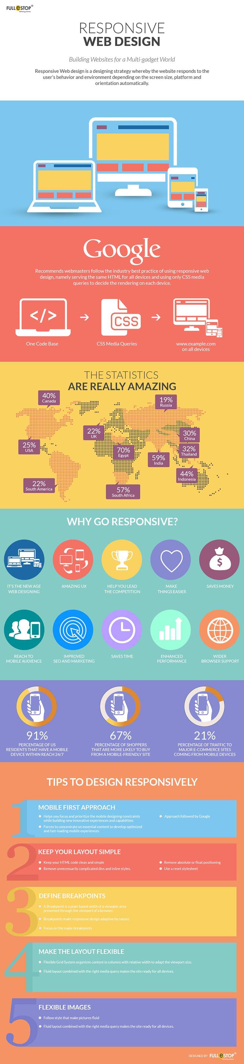
Responsive designs are used by many websites nowadays, because a responsive design can turn your blog design viewable in the mobile devices automatically. I have also seen a couple of issues that how would a person can check his website if his website is mobile responsive. Okay, let me explain it a little bit more about how to make your WordPress blog mobile responsive. By the way, out there on WordPress plugins repository many plugins are available which let you turn your blog design viewable in mobile devices.
Read: Top 10 WordPress Plugins to Make your Blog Mobile Responsive
But in this article I’m only going to show you the Mobile Responsive Design Testing Tools. Let’s get in, if you are here for the same reason.
1. Responsive Design Testing – Mattkersley
2. Mobile Responsive Design Testing – StudioPress
3. Pixel Perfect Responsive Design Testing Tool