Make Responsive Layouts for Email with AntWork
Responsive designs are now becoming common as the technology is growing very fast. Let me tell you about what actually responsive design is made for? Well, a responsive design response to the screen sizes of electronic devices some people use Ipad, iPhone, mobiles, tablets and browse your website. If your site has enabled the responsive design then your site will be compatible in the screen size that your users used to browse from, if you don’t have enabled responsive design then your site might not be able to fit in the screen size.
If you are using WordPress then you can make your blog mobile responsive using plugins. Well, here are the top 10 WordPress plugins to make your blog mobile responsive also see top 5 mobile responsive design testing tools.
In this article, let me show you a simple responsive layouts for email.
Responsive Layouts for Email
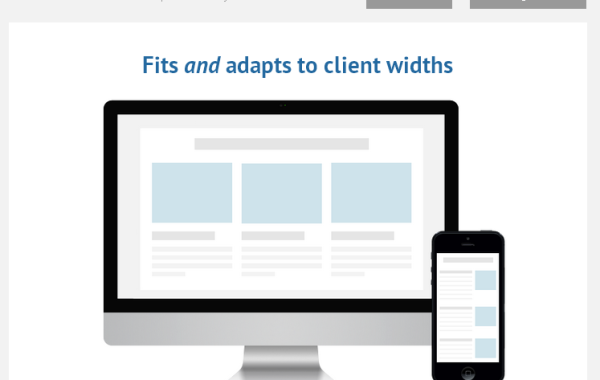
Antwort is a free responsive template for email newsletters that still uses tables but aims to provide a responsive layout. It’s multi-column layout where columns are transformed into rows in smaller screens. To use Antwork, click here for getting starter guide.

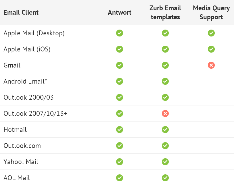
Compatible with Following Email Clients

