How to Add Responsive Columns in WordPress via Shortcodes
Adding columns to individual post or page in WordPress maybe needed while blogging with WordPress. So, I realize that this would be better if I write an article about adding responsive columns in WordPress. I’d published an article for Genesis Framework users before about How to Insert Columns in WordPress Blog Posts/Pages with Genesis Easy Columns? But, in today’s article let me just show you about adding responsive columns in WordPress via shortcodes.
Adding Responsive Columns in WordPress via Shortcodes
WEN’s Responsive Column Layout Shortcodes is WordPress plugin which easily adds responsive columns layout inside of your WordPress blog posts and pages just by wrapping content with a shortcode. To use and add responsive columns in your blog posts/pages you can simply use the plugin’s button in the editor to add columns.
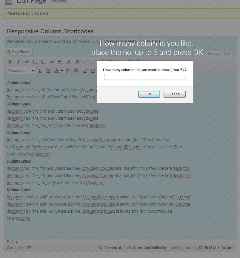
Or you can also add the following shortcodes in the post/page editor to display the columns according to your needs. The columns are responsive and will occupy the whole width of your screen.
- 2 column layout: – [bscolumns class=”one_half”]Your Content Goes here[/bscolumns] [bscolumns class=”one_half_last”]Your Content Goes here[/bscolumns]
- 3 column layout: – [bscolumns class=”one_third”]Your Content Goes here[/bscolumns] [bscolumns class=”one_third”]Your Content Goes here[/bscolumns] [bscolumns class=”one_third_last”]Your Content Goes here[/bscolumns]
- 4 column layout: – [bscolumns class=”one_fourth”]Your Content Goes here[/bscolumns] [bscolumns class=”one_fourth”]Your Content Goes here[/bscolumns] [bscolumns class=”one_fourth”]Your Content Goes here[/bscolumns] [bscolumns class=”one_fourth_last”]Your Content Goes here[/bscolumns]
- 5 column layout: – [bscolumns class=”one_fifth”]Your Content Goes here[/bscolumns] [bscolumns class=”one_fifth”]Your Content Goes here[/bscolumns] [bscolumns class=”one_fifth”]Your Content Goes here[/bscolumns] [bscolumns class=”one_fifth”]Your Content Goes here[/bscolumns] [bscolumns class=”one_fifth_last”]Your Content Goes here[/bscolumns]
- 6 column layout: – [bscolumns class=”one_sixth”]Your Content Goes here[/bscolumns] [bscolumns class=”one_sixth”]Your Content Goes here[/bscolumns] [bscolumns class=”one_sixth”]Your Content Goes here[/bscolumns] [bscolumns class=”one_sixth”]Your Content Goes here[/bscolumns] [bscolumns class=”one_sixth”]Your Content Goes here[/bscolumns] [bscolumns class=”one_sixth_last”]Your Content Goes here[/bscolumns]
If you have any questions, leave a comment below…


Thank you for the article regarding the responsive column layout !
Please download this plugin and use it in your wordpress blog/site. If there’s anything bug found, get back to me on Email: [email protected]
Cheers !
Hi, I am trying to use the plugin to make responsive columns in the theme of twenty thirteen, it seems not working. Can you figure out?
Oh, sorry, it is working. Looks very good! Thanks!
Your welcome @Cindy.
@Cindy, please feel free if you have any bugs regarding this plugin. I have recently updated some bugs which was discussed by other guys in support forum. If you have using this in any site, you can update it again. Also, feel free to rate and comment if you like it.
Cheers
Bhuwan
Hi,
I want to put this on php template, is there another shortcode I will use?
You can use the shortcode in your Php template by using the following snippet on your PHP template:
Thanks for commenting the informative question 🙂 I appreciate it.